This post is part of an ongoing series of resume samples documenting the makeovers we gave our clients. Each resume was created by the Blue Sky Resumes team but the details have been changed to protect confidentiality. We hope the resume samples and our strategy explanations will inspire you to makeover your own resume.
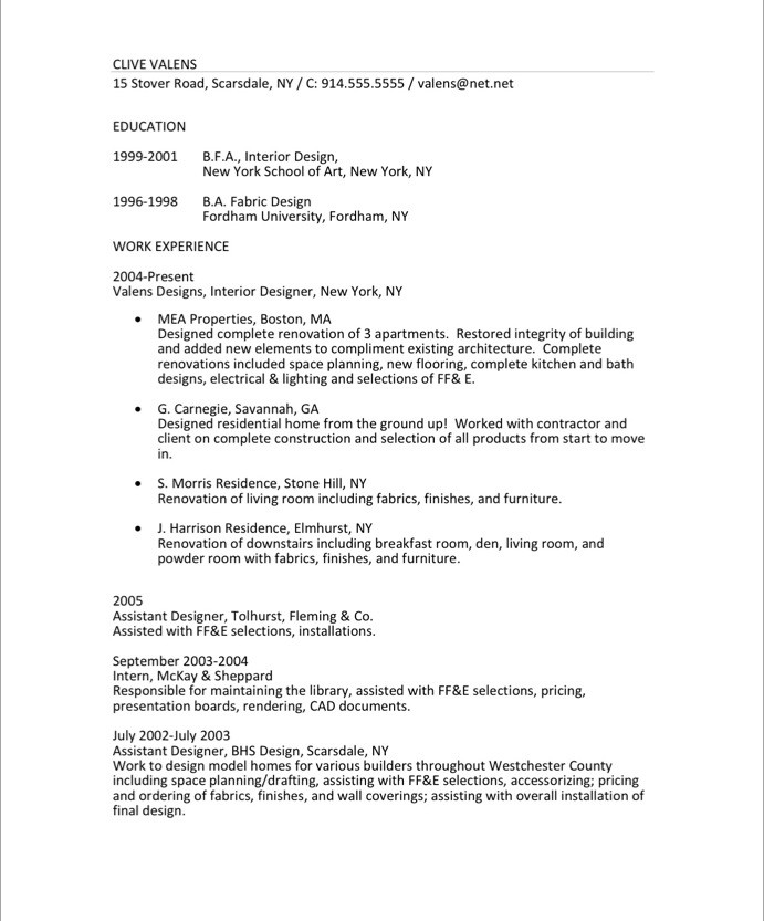
Clive Valens was an interior design client who came to us a couple of years ago. Despite strong experience, he wasn’t getting as many interviews as he would have expected and he felt his resume was the problem. Having taken a look, we agreed.

Clive had started his resume with his design education, because he felt this would be important for employers to know. But employers know to look at the end of the resume for education information. If that’s important to them, they’ll find it.
By starting this way, Clive was selling himself short. He wasn’t using prime real estate on his resume to tell employers what they most needed to know.
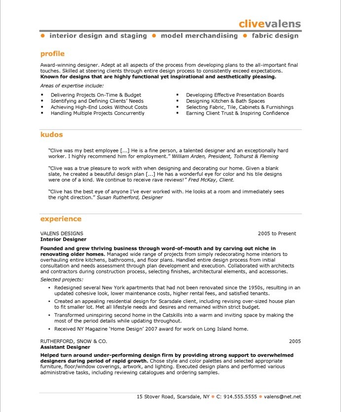
With the resume rewrite, this became our focus. We used the first 2/3 of page one for a summary of his background and his design approach, a list of key skills, and some quotes from former clients and employers. The result is much more powerful as you can see.

What this means for you
Determine what makes you most valuable to your target employers, then make sure you use the first 2/3 of your resume to send those messages clearly. Don\’t waste space on generic phrases or on information that won\’t be of primary concern to your target audience. Always remember that many of them won\’t even read the whole resume, so you must tell a concise version of your story right upfront.
For more ideas on how to do this, check out more of our resume samples, and to get all the inside scoop on our resume writing tricks and strategies, register now for our free course. You’ll be amazed at what a difference a few easy changes can make.


Comments are closed.