I’ve given a lot of practical resume tips over the years, but I think it’s often hard to apply general tips and strategies to your own very specific situation. So to help you visualize how these tips can be applied to an individual’s work history, I’m going to start a regular series in which I’ll show you some of my resume makeovers. These are real clients although their names, contact information and work histories have been disguised heavily.
Every two weeks, I’ll post a “before and after” resume and explain the reasoning behind the decisions I made. Hopefully, these real world examples will help you step back and take a look at your own resume – especially if you haven’t been getting a great response to yours.
Our Client
Clive came to us a few years ago. He had been employed in a couple of internships since leaving college but had been unable to secure a full-time position. As we do with all our clients, we had Clive complete our proprietary self-examination questionnaire, The Explorer. There’s very little this questionnaire doesn’t catch, and once I reviewed his answers, I knew what our strategy would be.
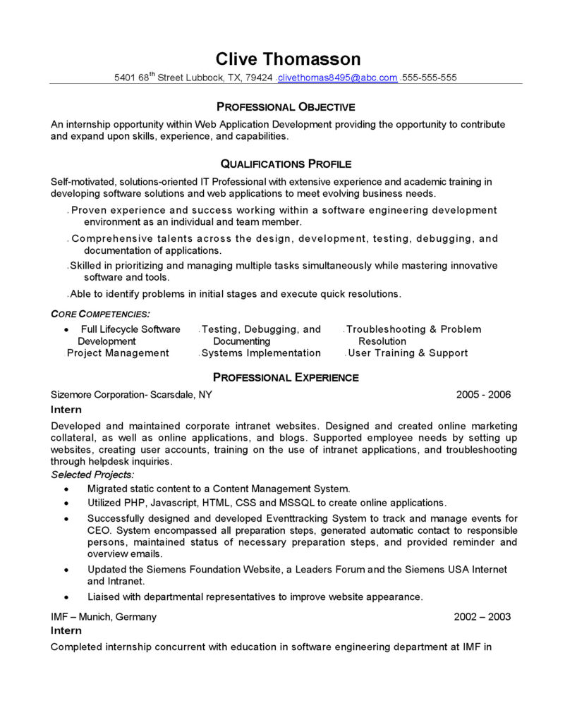
Web Developer Resume – Before
But first let’s start with the resume Clive was using when he signed up with Blue Sky (click the resume to see a larger version of page one)

Clive had done many of the right things with his resume. He had presented himself professionally and in an organized manner and he had tried to communicate what made him valuable to potential employers by creating a ‘qualifications profile.’
But speaking as someone who has done more hiring than I care to remember, this resume just doesn’t stand out. At all! Nothing about it says ‘hire me’ – and this is a particular problem when you consider that Clive has very little work experience. Not to mention the gap in work history. The resume was written at the beginning of 2008 and you can see that his last internship ended in 2006. All in all, when this resume lands on an employer’s desk, it is not going to be there long before it winds up in the ‘no’ pile.
The Makeover
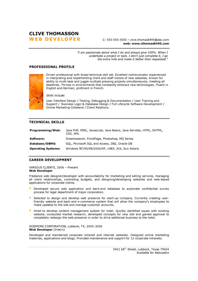
Here is page one of the resume I created for Clive (again, click to enlarge):

Key points to note:
- Clive was from Germany and was waiting for a US work visa to be approved. This is why he hadn’t worked since 2006. But he was a keen designer and had used his time to work pro bono on a variety of assignments. Therefore, I wrote about these as freelance work and positioned them above his internship. There is no rule that says experience has to be paid to be valuable.
- When you are relatively new to the workforce, your passion and attitude and enthusiasm are one of your best selling points. (Trust me, very few of your competitors are communicating these things!) So I spiced up the introduction to Clive’s resume with a quote from his Explorer worksheet. This jumped out at me when I read it as exactly the kind of thing employers needed to know about him and yet it’s nowhere to be seen in his old resume. No matter what stage of your career you’re at, conveying passion is key.
- Clive is a gifted designer, but you wouldn’t know it from his resume. Now there are limits to what can be done with resume design, for reasons I explain here, but those limitations don\’t stop us being somewhat creative. I checked Clive’s website and found a beautiful clean orange and gray design. As much as possible, I replicated the look on his resume (including the image, which was lifted directly from his site). Make sure you’re presenting a consistent and eye-catching look across all media – especially if you are in a creative profession.
- As a developer, technical skills are key and yet Clive had hidden his one page 2 of his resume. Since he is just starting out in his career, it’s very important that he show employers the scope of his knowledge. I moved these skills up on to page one. Make sure key information is right upfront.
- Personality is key in a resume. Clive’s old resume was full of the words people think sound good in a resume (for example “skilled in prioritizing and managing multiple tasks simultaneously while mastering innovative tools and software” but be honest – doesn’t that sound like a big bunch of blahblahblah when you read it? Would you be excited to meet that person? Compare that to the quote from Clive where he expresses real enthusiasm and personality and there’s no competition. Be yourself in your resume – don’t use words you’ve seen other people use if they don’t sound like you.
- There are people who disagree with me on this last point, but I think simple and clear language is key in a successful resume. Don’t use twenty words when ten will do – and don’t use long words just because they sound more official. The language in the new resume is much clearer and easier to read than in Clive’s original and therefore it packs more punch. Be direct, concise and easy to understand.
The last I heard, Clive’s visa came through and he had secured several interviews for entry-level development jobs with web design agencies. He was truly surprised at the change in reaction to his resume and yet nothing about him, his skills or his career history had changed – just the way he presented himself in his resume.
That’s the power of making these kind of changes and if you’re struggling to get interviews, I hope seeing this example inspires you to take another look at your own resume.
Good luck … and if you need step-by-step help in writing your resume, check out The Blue Sky Guide to Resume Writing. In this downloadable eBook, I walk you through the entire resume creation process from start to finish, just as I did in this blog post. Your resume will never be the same again!

Comments are closed.