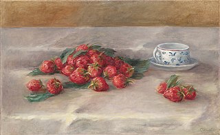
Earlier this year I took an art class where one project was to copy a famous painting. I chose the one you see here by Renoir and managed a fairly unimpressive copy that lacks the beauty of the original. But the process was really fun and very educational because I learned so much I wasn’t expecting.
Not least of my discoveries was that the pleasing unity of the painting wasn’t an accident. Instead colors were used to unify the painting. The red of the strawberries also appeared in the orange. The blue of the vase was echoed in the shadows of the dish and the folds of the tablecloth, and the white jar is actually yellow and orange. Also notice that green is featured throughout – the green leaves, the green shadows on the tablecloth and the green around the edge of the orange.
Since completing this exercise, I’ve been much more conscious of color in my paintings and last night I was working on a landscape that just wasn’t coming together. I decided to try taking the main foreground color and adding that into the clouds and voila! The whole painting started to come together.
My painting before I made this change reminded me of so many resumes that I see every day. Lots of information but no cohesive, unifying message, and unity is the key to a successful resume. So think of the themes of your career like colors – if you repeat one theme throughout the resume, you can paint a cohesive picture that makes sense.
Image Credits: Source/Photographer https://www.moma.org/collection/works/83425?artist_id=4869&locale=ja&page=1&sov_referrer=artist
https://creativecommons.org/licenses/by-sa/4.0/deed.en
